

When a Project Stops Being Just a “Project” and Becomes a Recognizable Entity
There is a dual role when we talk about visual design for scientific and academic projects. The first is related to how the project will be perceived by society, whether by the academic community or by the general public.
Developing an identity that starts with color characteristics, a unique logo, and a coherent visual language is important because the project moves beyond the purely textual layer where many academic initiatives remain—often restricted to scientific papers—and becomes an entity in its own right.
The project ceases to be merely “a project” and becomes something recognizable, with its own identity. This is important because it introduces the subject matter in a way that makes the project tangible and concrete. It gains presence, personality, and the ability to be remembered.
However, there is a second and equally important benefit, one that exists within the research team itself. When we talk about a project with a brand, it is as if the researchers are, in some way, part of an organization. The brand creates a sense of belonging among those involved in the project.
People begin to see themselves as part of something that has a name, characteristics, principles, and clearly defined goals. This changes the way the team relates to the project itself. There is a stronger sense of collective identity.
And this goes far beyond aesthetics. It is not simply about “looking good.” It is about creating meaning that helps researchers recognize the project as something they truly belong to.
Visual Design Is Only the Visible Tip of Something Much Bigger
When DataShipper works on building a brand for an academic project, the process does not begin by choosing colors or designing a logo.
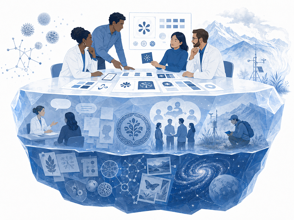
The first step is an in-depth discovery process involving the researchers. We seek to understand the different perspectives surrounding the project, its scientific objectives, the team’s values, what each individual is pursuing, and even what kind of recognition each researcher hopes to gain from participating in the initiative.
We also seek to understand more subjective aspects. We ask what characteristics would make someone recognize the project. If the project were a human being, what would it be like? Would it be more serious? More technical? More accessible? Closer to society? More academic?
These are the kinds of questions that help reveal the project’s personality.
We also explore elements that are directly connected to the work being carried out. In the CAIPORA project, for example, people naturally associated the name with the folkloric character Caipora itself. In the ATIIM project, researchers strongly connected the initiative with pollen grains. In AERIS, references emerged related to field data collection, atmospheric aerosols, and even the colors of the sky during sunrise and sunset under aerosol-rich atmospheric conditions.
As a result, a very strong qualitative assessment takes place. It is not only about expectations and emotions, but also about symbols, references, and elements that are meaningful to that particular group of researchers.
All of this later supports the creative process: colors, typography, logo design, tone of voice, and even the definition of the brand persona—that is, if the brand were a person, what would that person be like?
This process also reveals something extremely important: the human principles and values embedded within the scientific project.
In the end, the visual work is almost a consequence of something larger. What is actually being built is an identity capable of carrying the culture of the project itself.
To draw a parallel with companies, it is as if we were creating an organization while taking into account the culture of every individual involved.
When Visual Identity Stops Being Aesthetic and Starts Driving Productivity and Reach
The CAIPORA project is a strong example of this.
It moved beyond simply presenting scientific results and evolved into a complete digital presence strategy. The project gained a structured website, news sections, accessible content for the general public, dedicated areas for scientific data, and a consistent visual identity.
There was also an important challenge: the project’s final destination was Brazil’s Ministry of Health. In other words, we needed to create something that conveyed innovation and differentiation while still visually aligning with the institutional characteristics of the Federal Government.
This created a delicate balance between innovation, recognition, and institutional credibility.
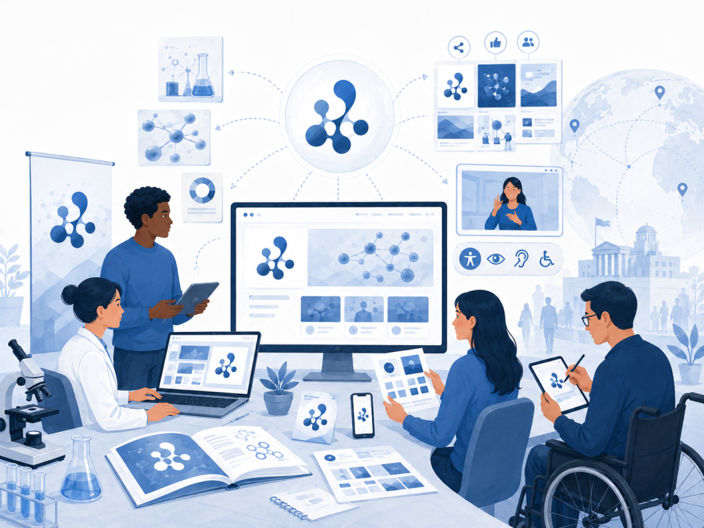
Once that identity was established, everything began moving faster. Social media channels could be created quickly. Visual standards for presentations, articles, workshops, and printed materials were already defined.
New materials could be produced much more efficiently because there was a solid foundation supporting them.
Meeting backgrounds, PowerPoint presentations, banners, graphic assets, and promotional materials naturally followed a coherent visual language. This creates recognition and allows anyone involved in the project to produce materials while maintaining a consistent identity.
Another important aspect of CAIPORA was digital accessibility. The project was developed with accessibility as a priority, including Brazilian Sign Language (Libras) resources, compatibility with screen readers, and other important digital accessibility practices.
Although accessibility is not necessarily a “visual” element, it originates from the principles established at the beginning of the process. In that sense, it is also part of the project’s identity.
This commitment was highly valued by the Ministry of Health.
The First Step Is Choosing a Name That Carries Meaning

The main advice for researchers who still underestimate the importance of this type of work is to start with the basics: give your project a name that carries meaning and purpose.
Naming a project is an extremely important step because it stops being merely “a project intended to do something” and becomes an entity with its own identity.
That name should be unique. It is important to conduct research to avoid conflicts with existing companies, brands, or even other academic projects.
It should also be easy to read and easy to remember.
CAIPORA is a good example of this. It is a highly memorable name. In the case of CAIPORA, the name had already been defined when DataShipper joined the project, so our challenge was to build the entire identity around it. In other projects, we have participated in the naming process from the very beginning.
Regardless of when it happens, there is always a search for something meaningful, because everything that comes afterward will be built upon that name.
Ultimately, the most important thing is that people can see themselves within it.